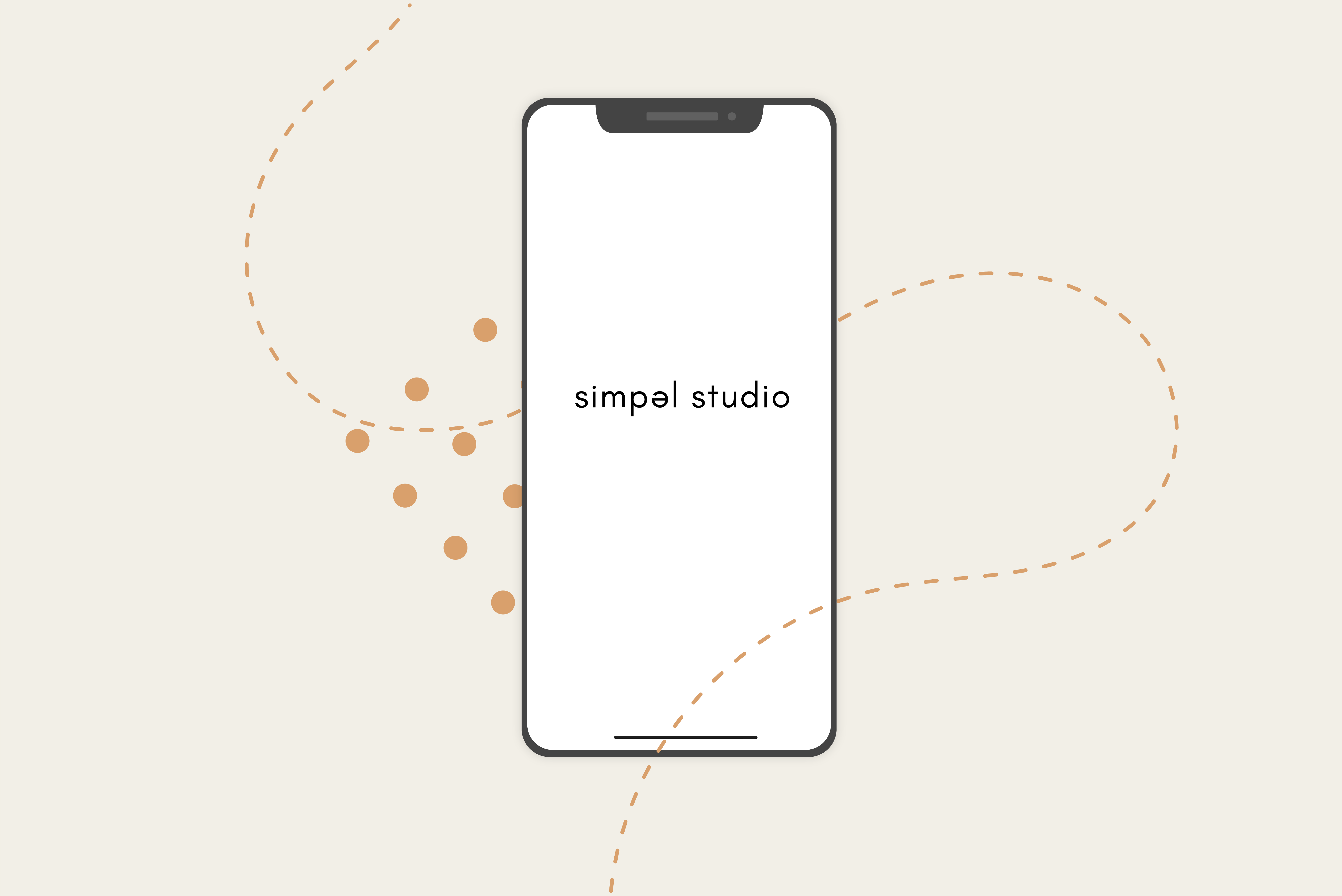
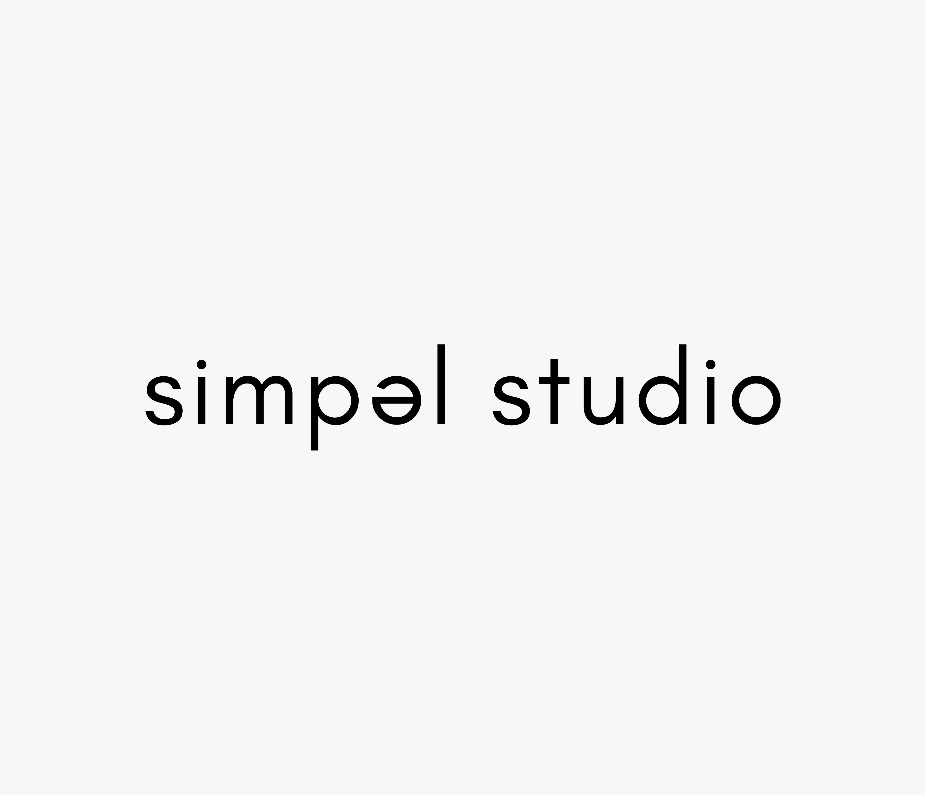
simpel studio
Simple. It is in the name.
We take the simplicity so literally that our signature upside down 'e', comes from the pronunciation of the 'e' in simple.
Our design and visual style, are minimalistic and handrawn, without becomming unclean. Our color choise are warm, damped and friendly.
The same friendly and openess are reflected in our logo and rounded typeface.
colors.
fonts.
Avenir
The font Avenir is used for headlines and body copy on the website. It is chosen because of the round, soft and simple typeface which represents our brand.
Glacial Indifference
The font Glacial Indifference has been used for creating the logotype.
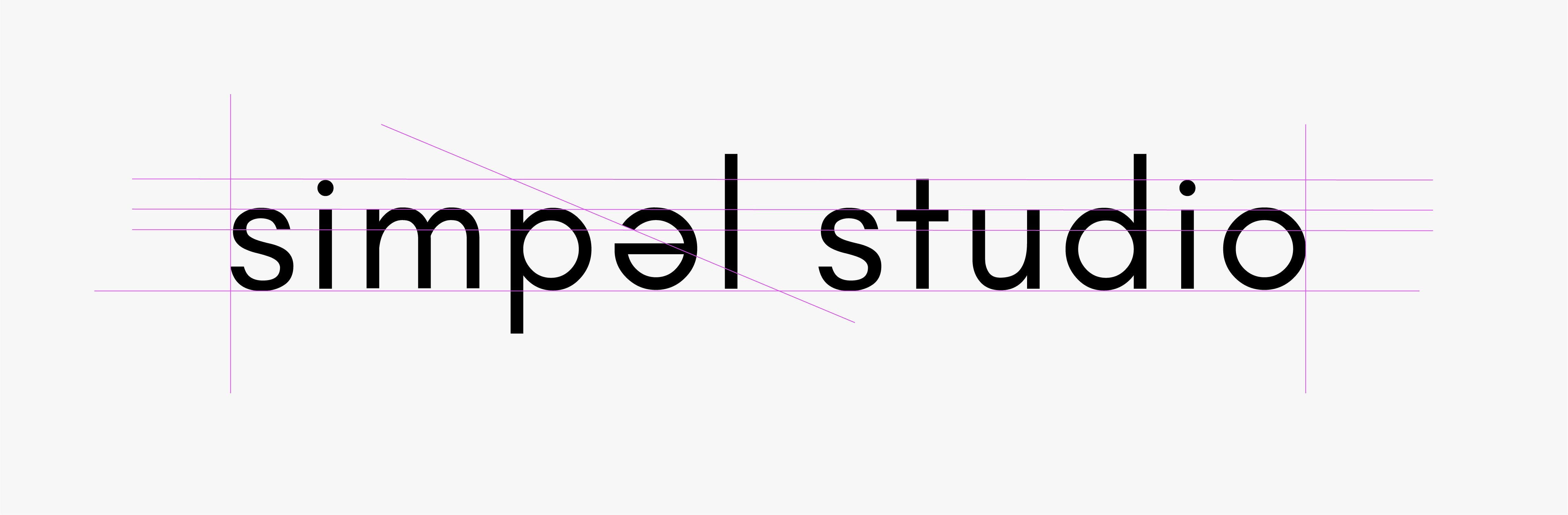
our logo has been creaed with simplicity and linearity in mind, as well as a rounded typeface, makes this logo soft and friendly.

our signature 'e', comes from the pronunciation of the 'e' in simple
graphic elements.